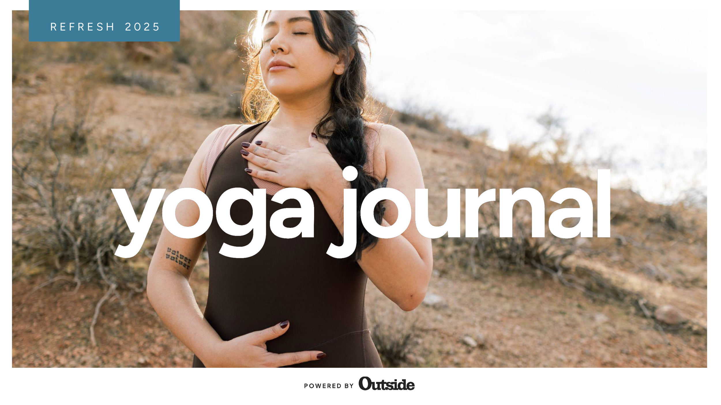
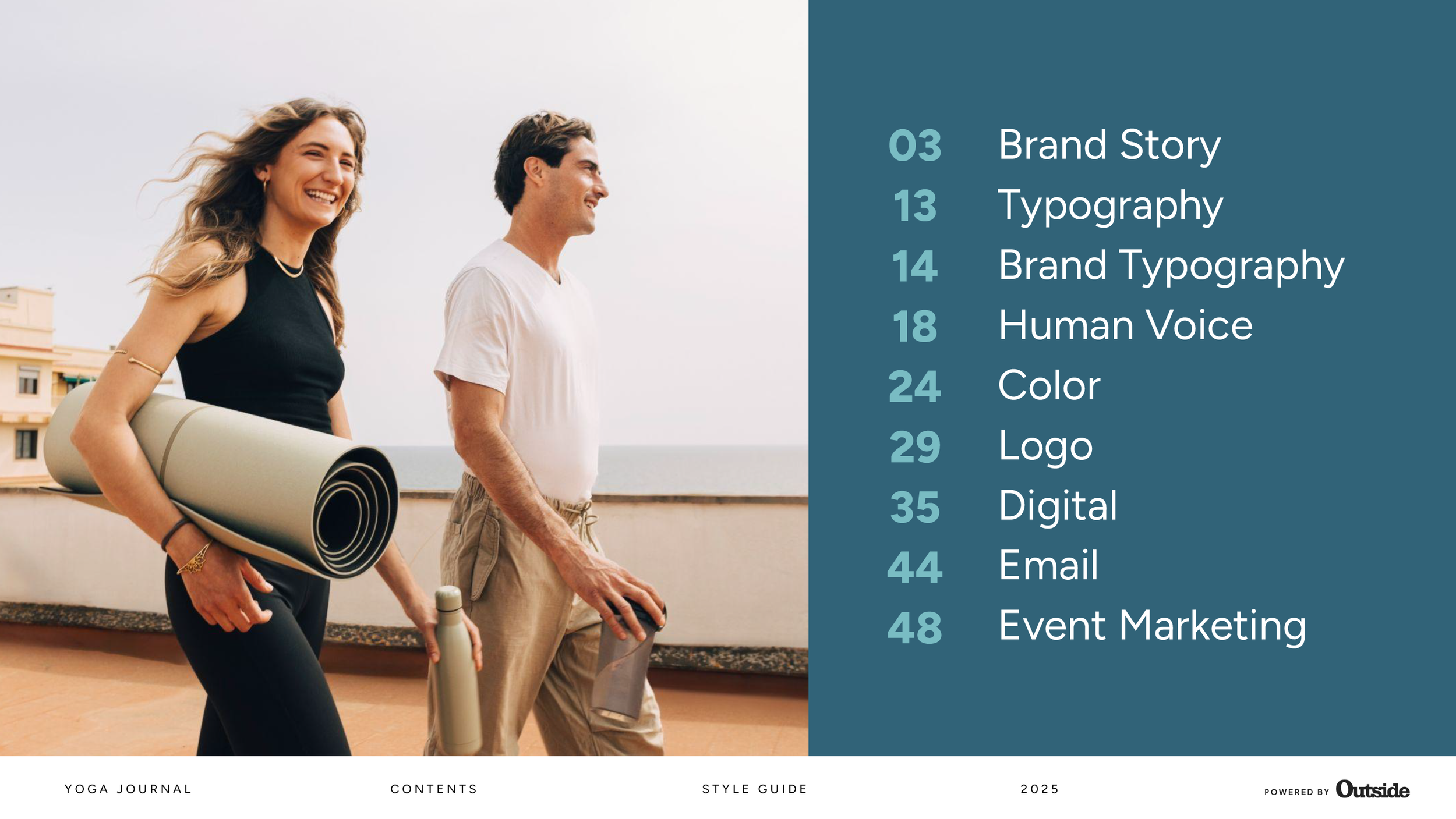
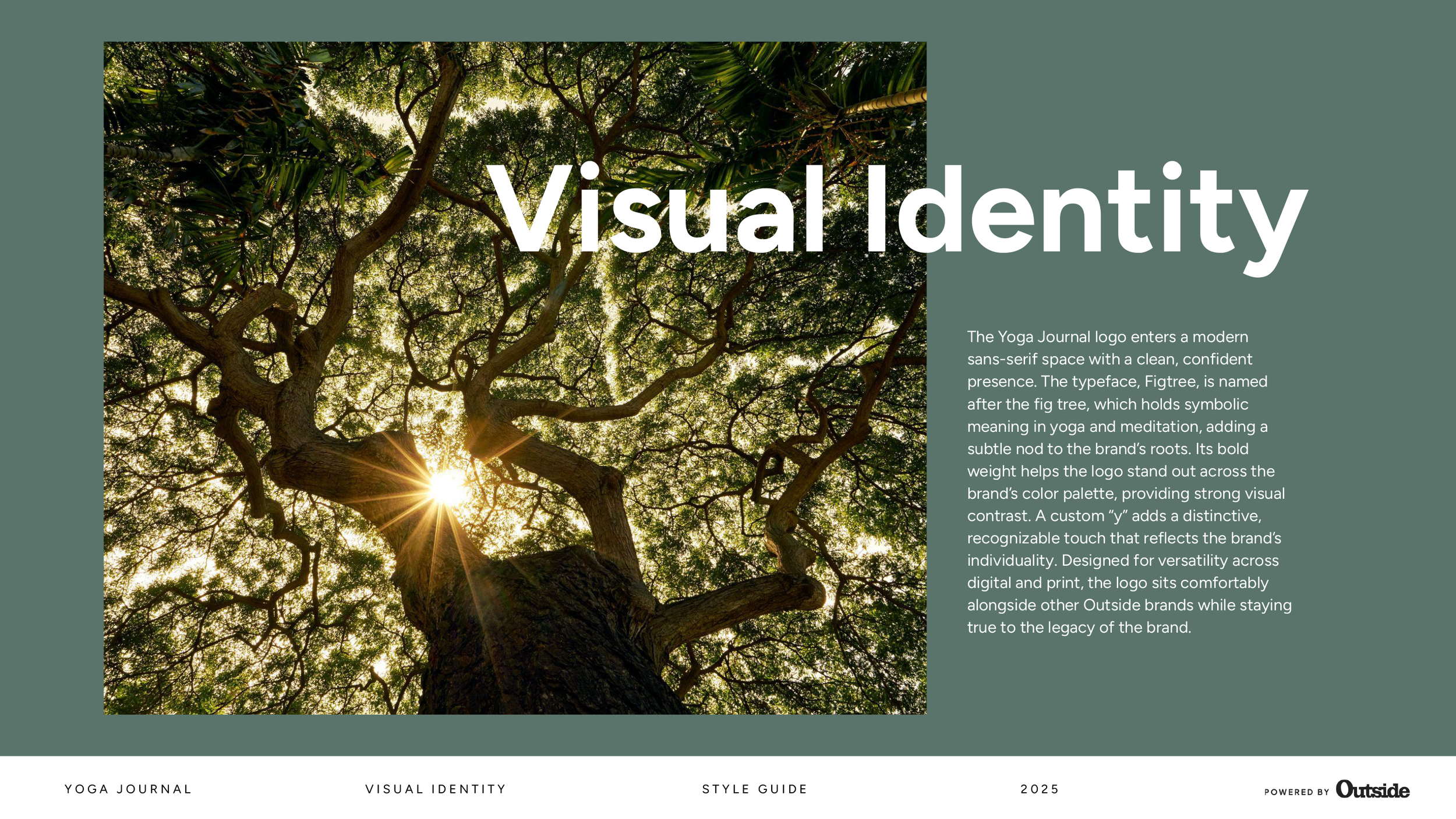
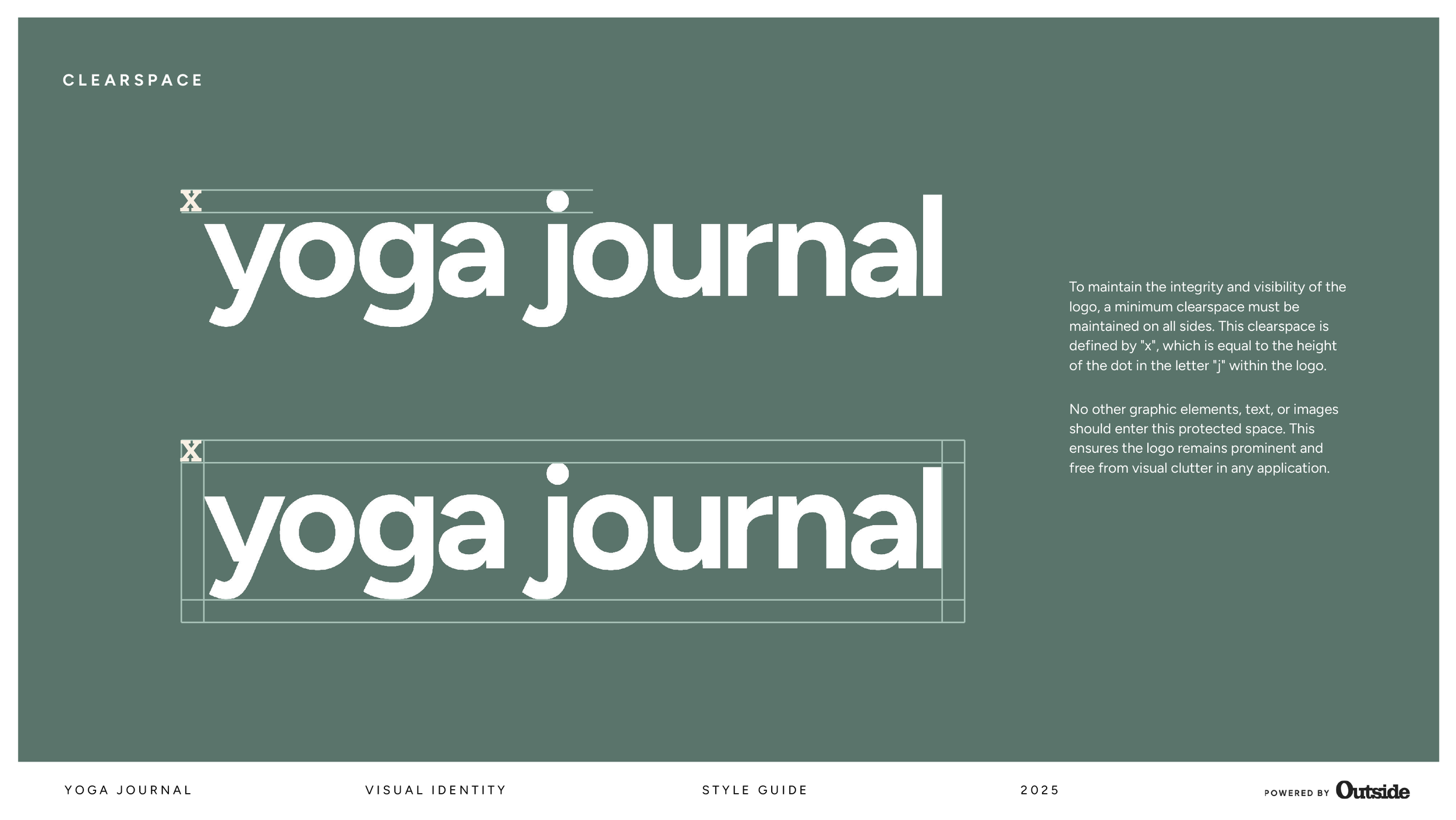
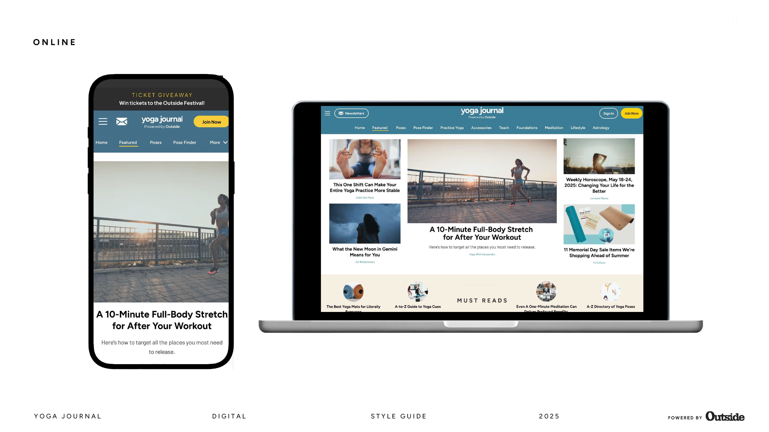
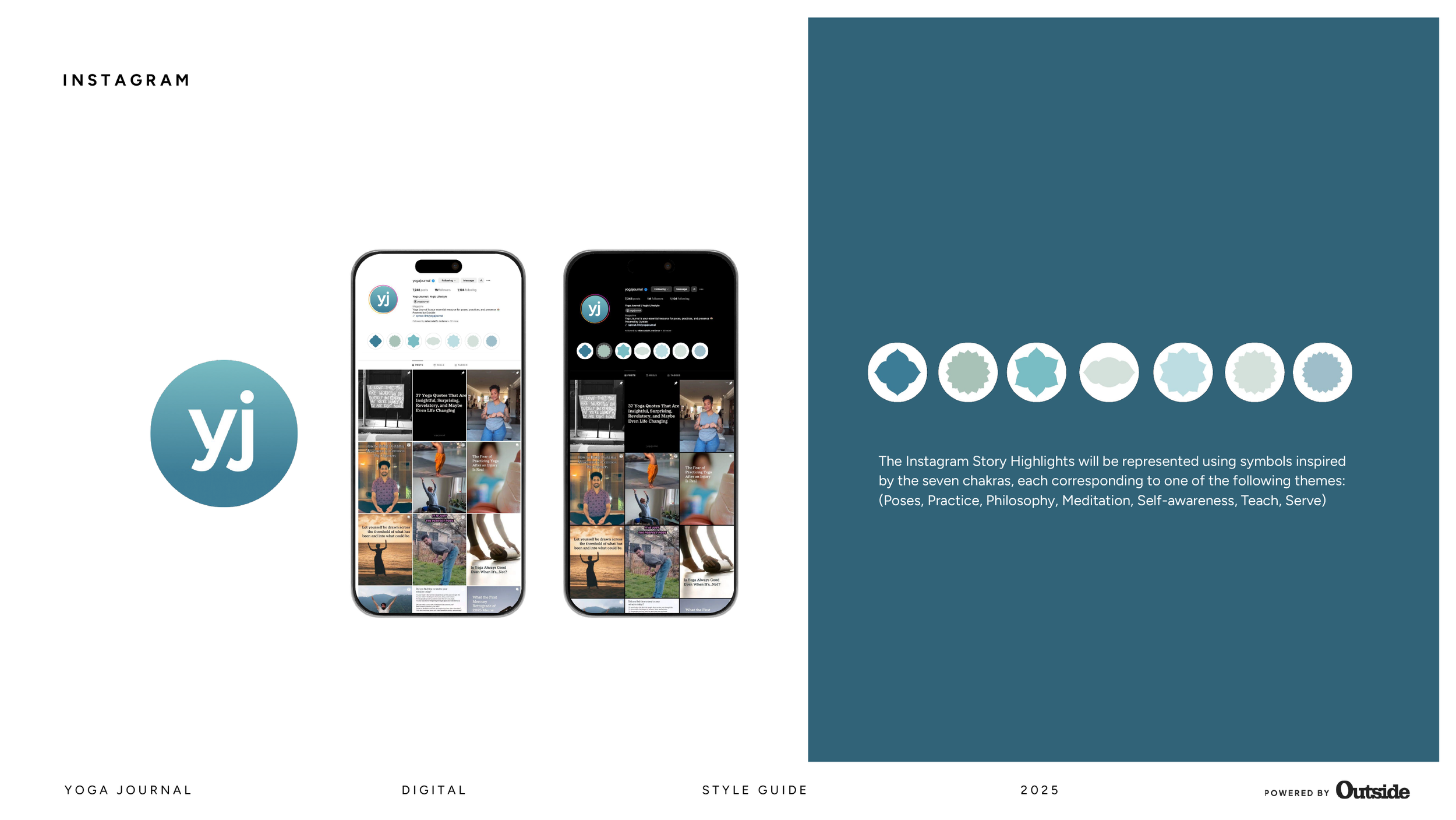
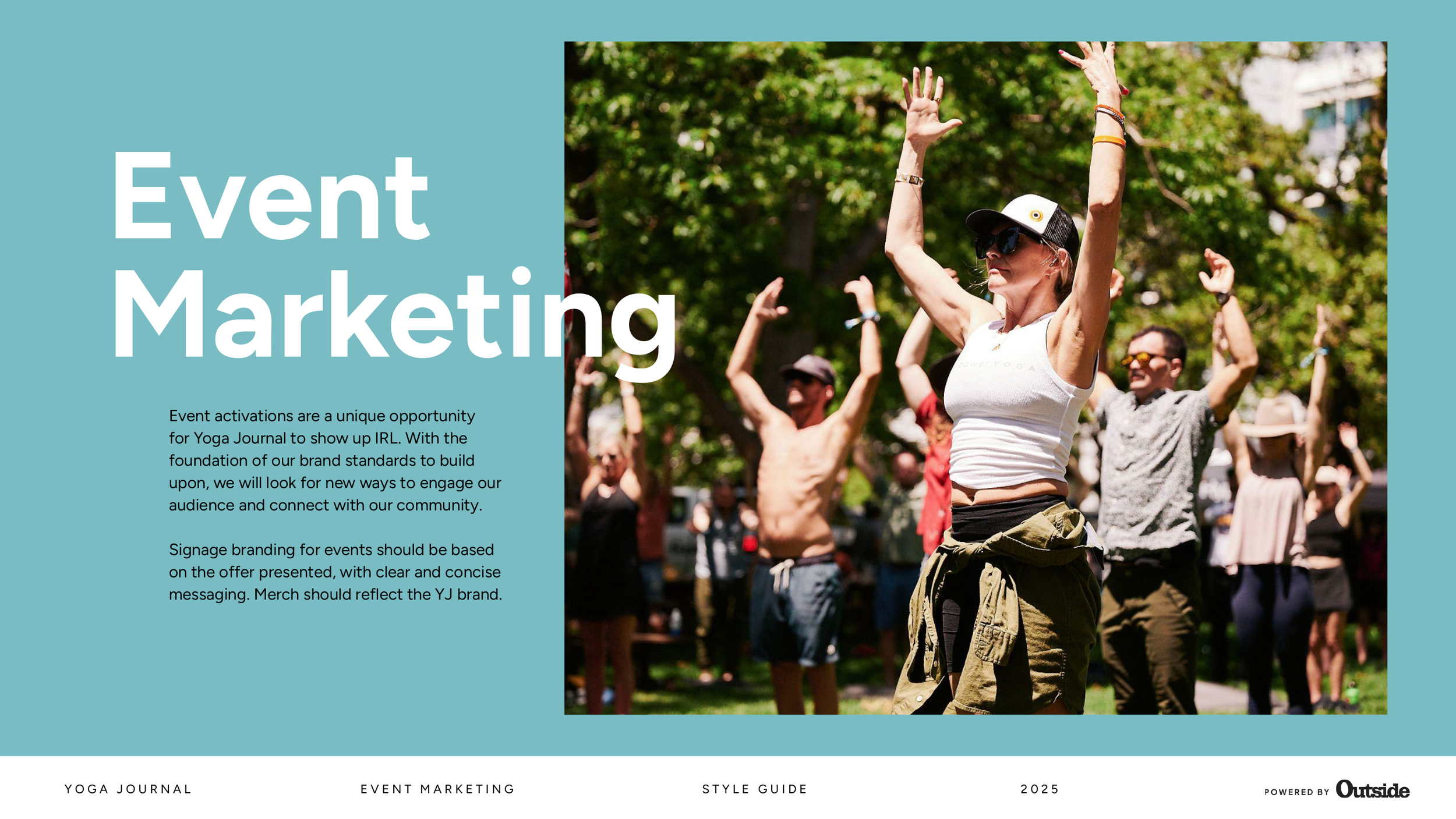
This brand style guide supports the redesign of Yoga Journal by clearly defining the publication’s visual direction. It sets out practical guidelines for typography, colour palettes, photography, and layout to ensure consistency across every issue and platform.
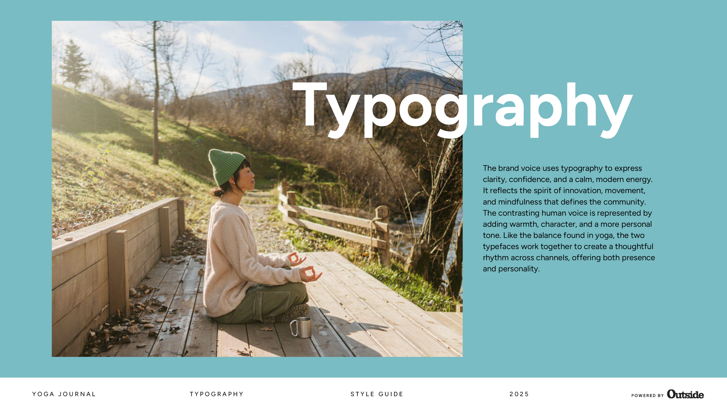
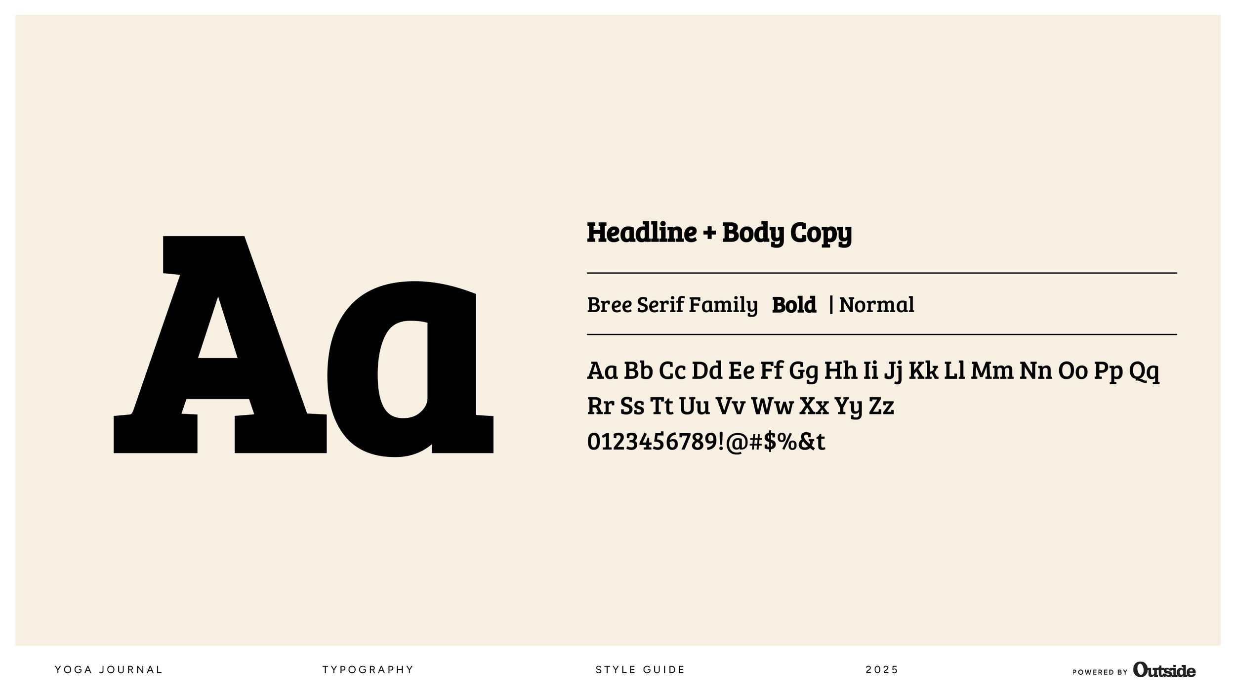
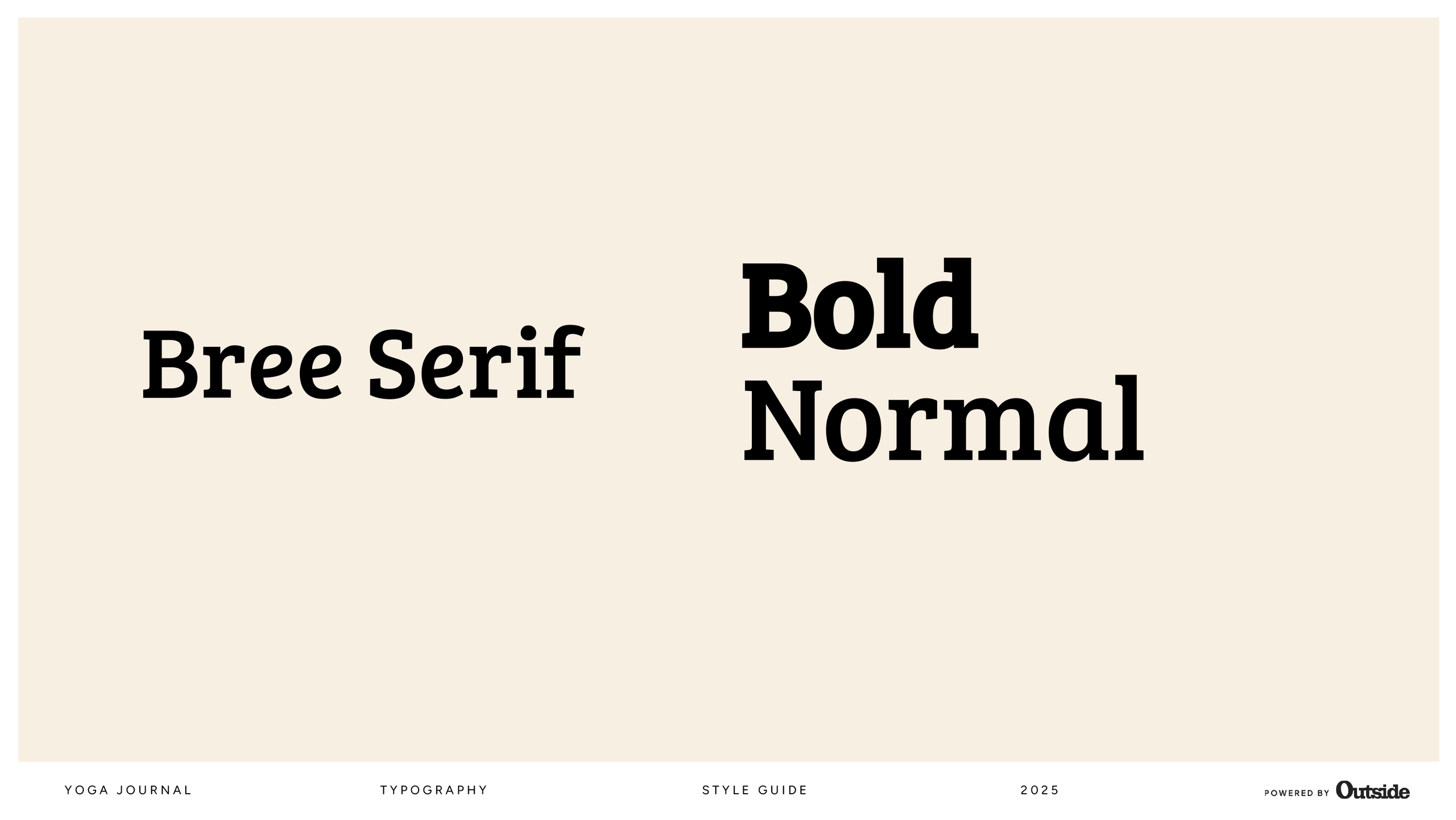
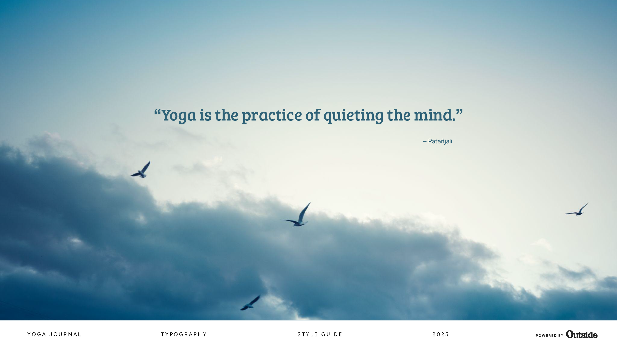
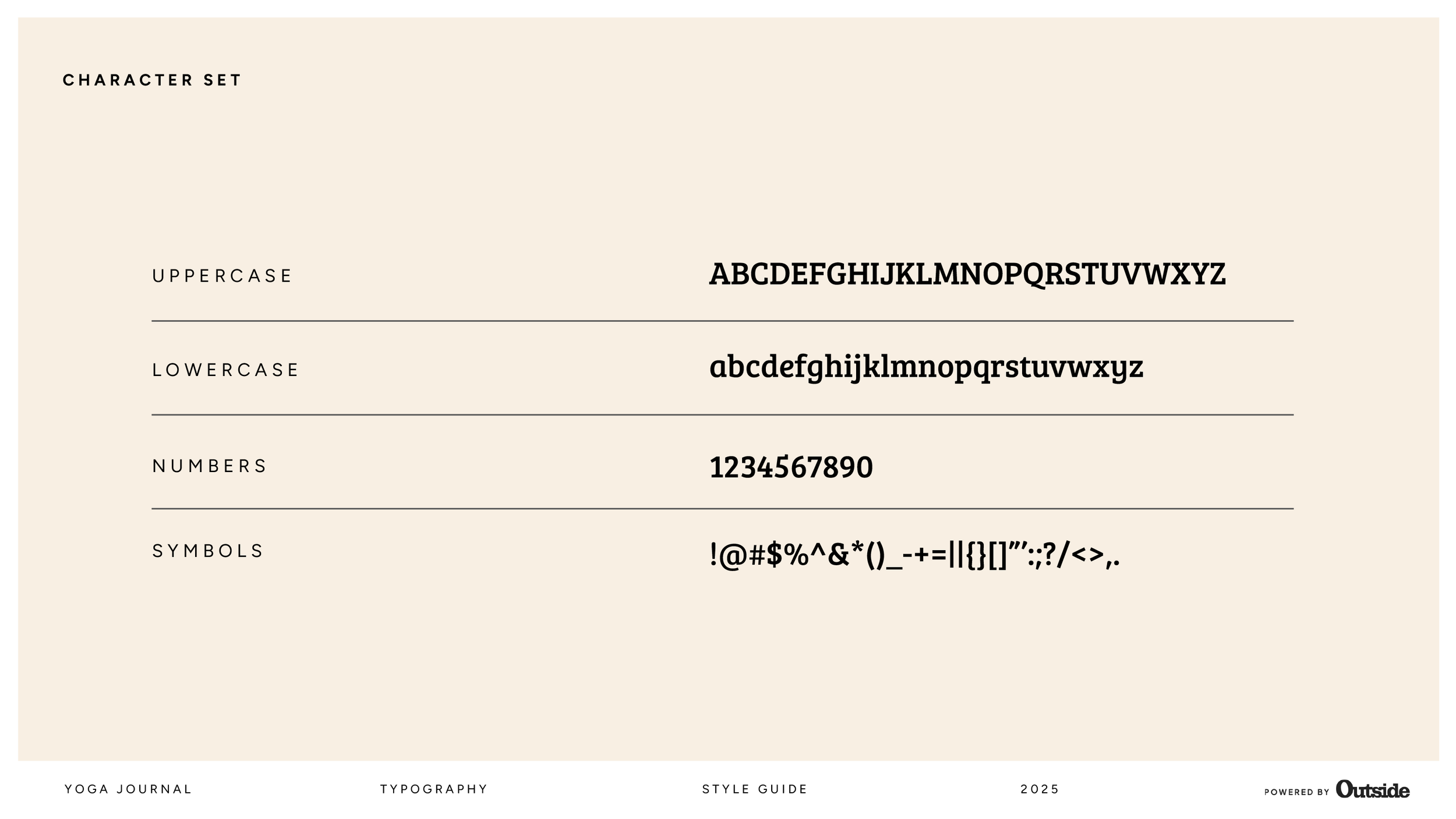
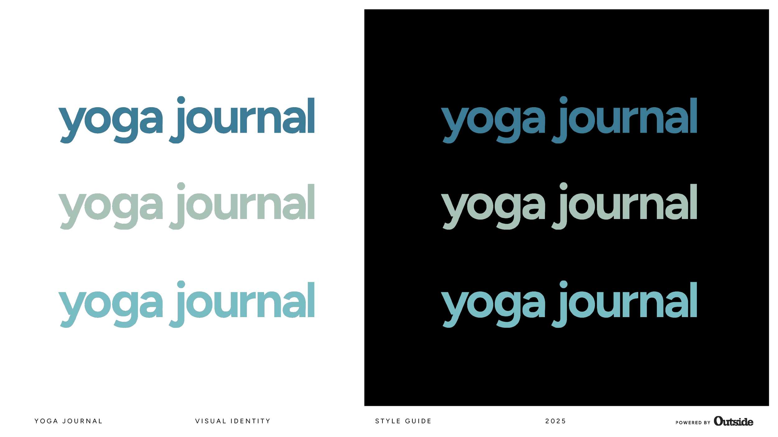
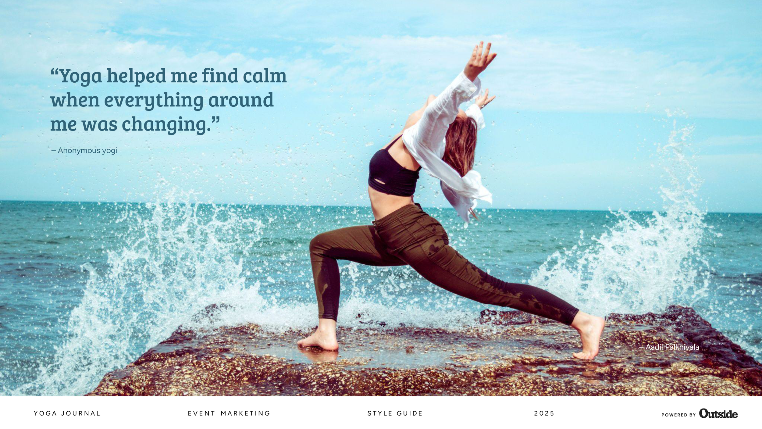
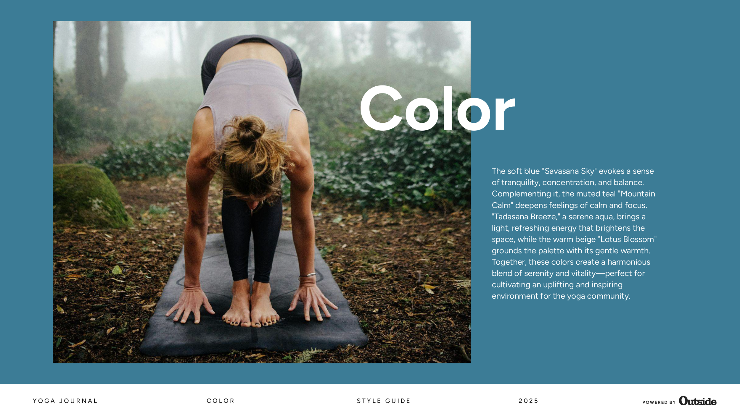
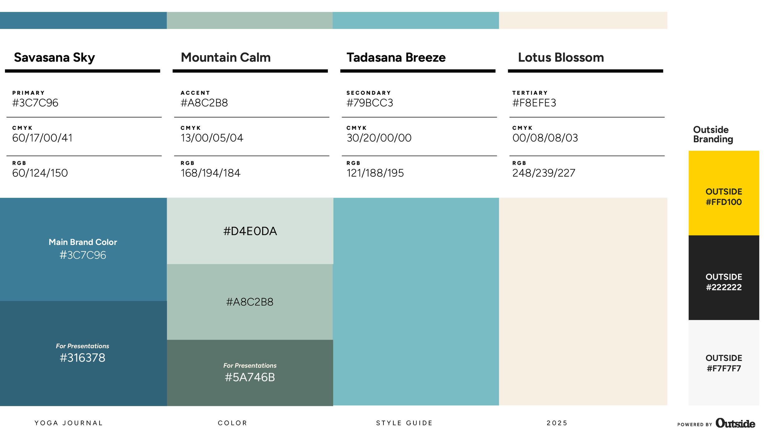
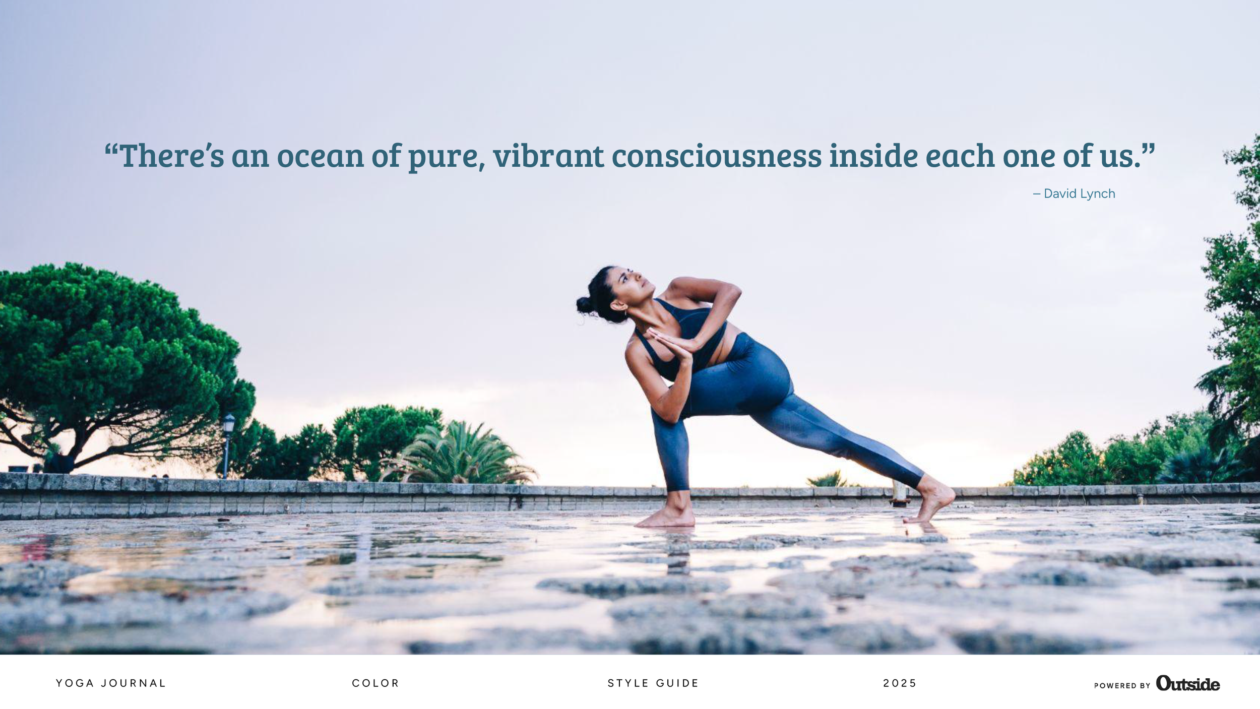
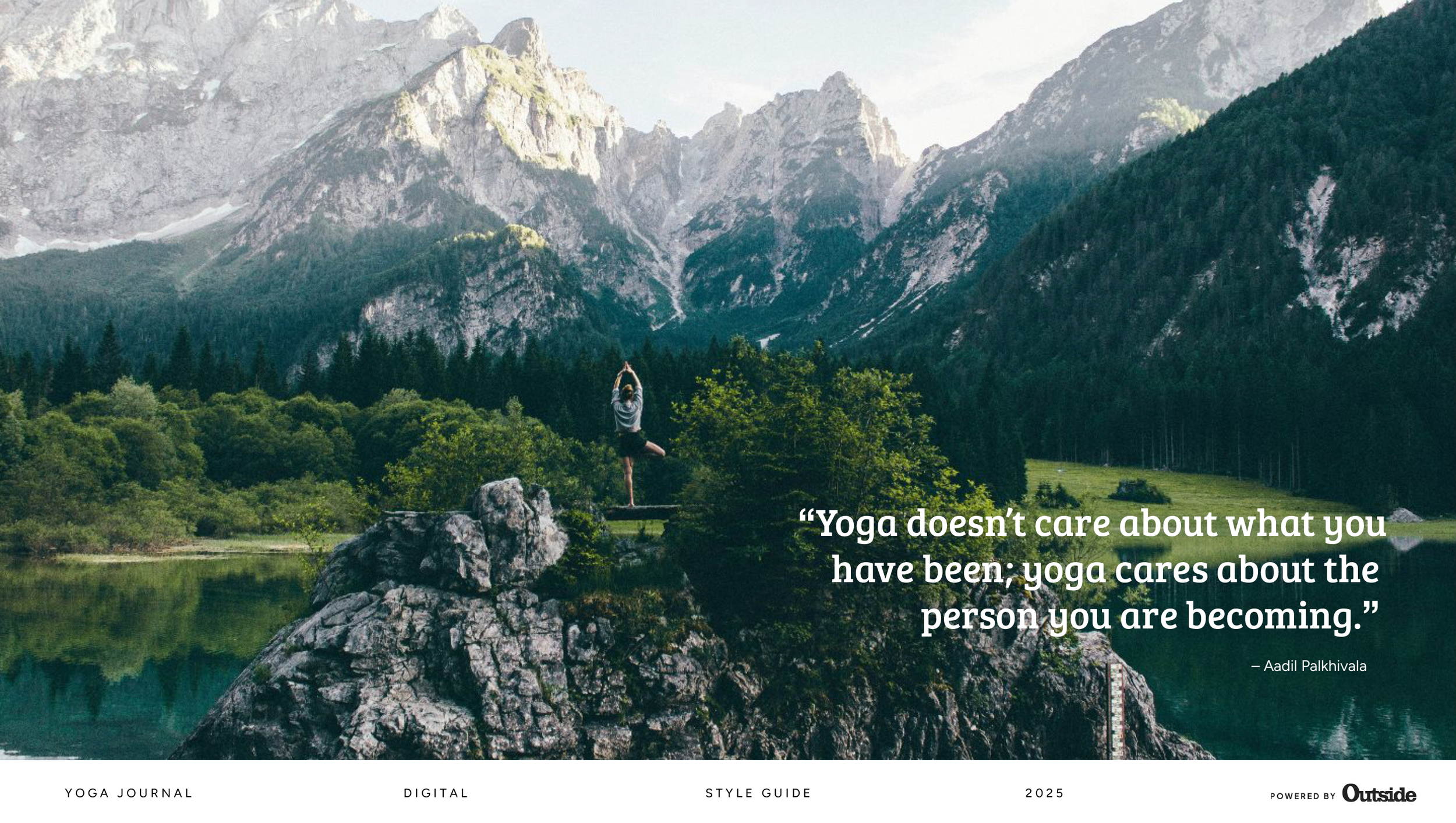
The refreshed identity reflects the core values of Yoga Journal—clarity, balance, and approachability—while bringing a more modern and refined feel to the brand. Clean typography, soft but confident colour choices, and natural, authentic imagery work together to create a calm and contemporary look.
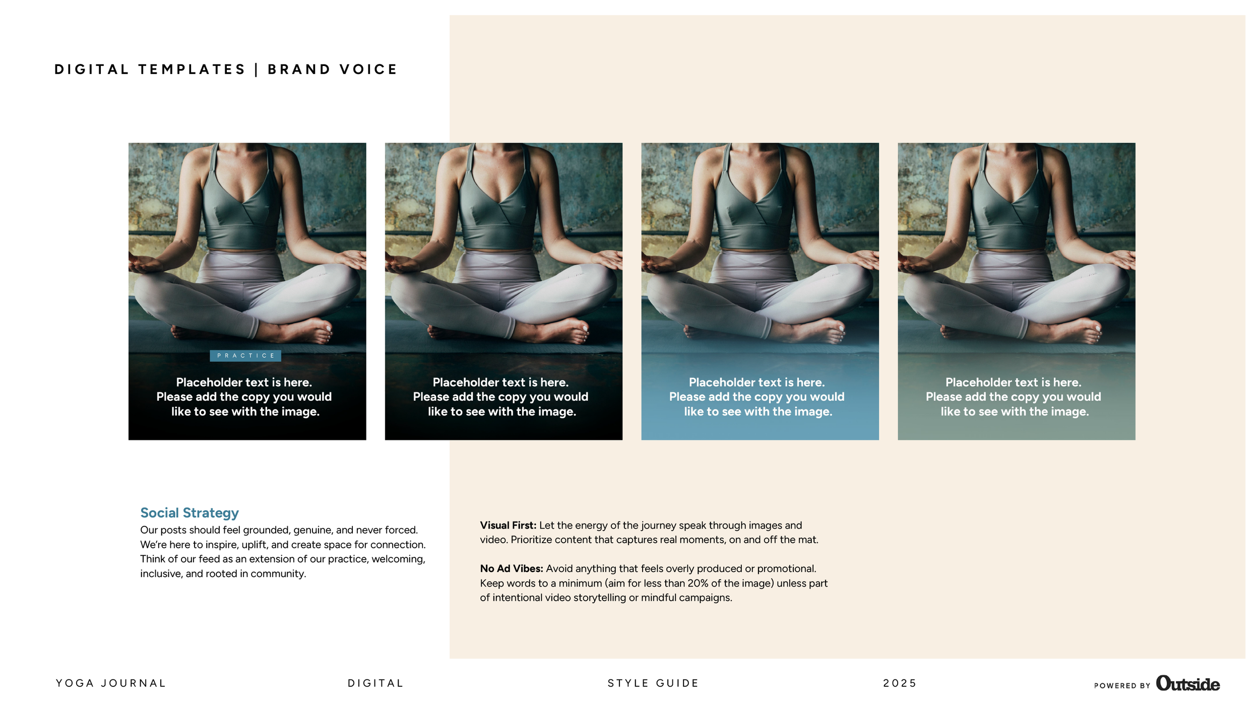
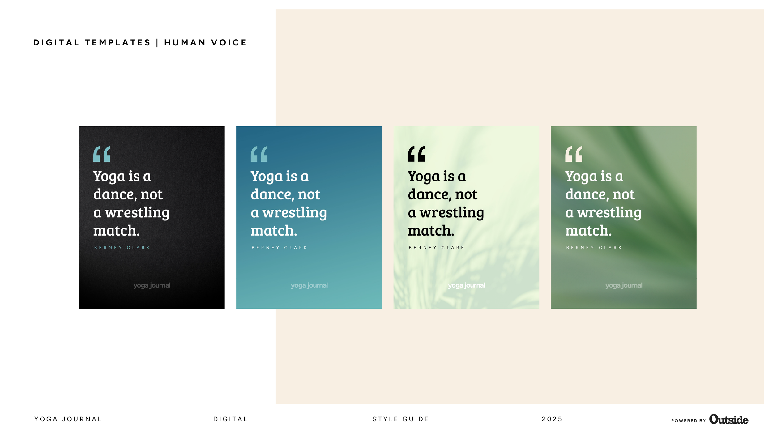
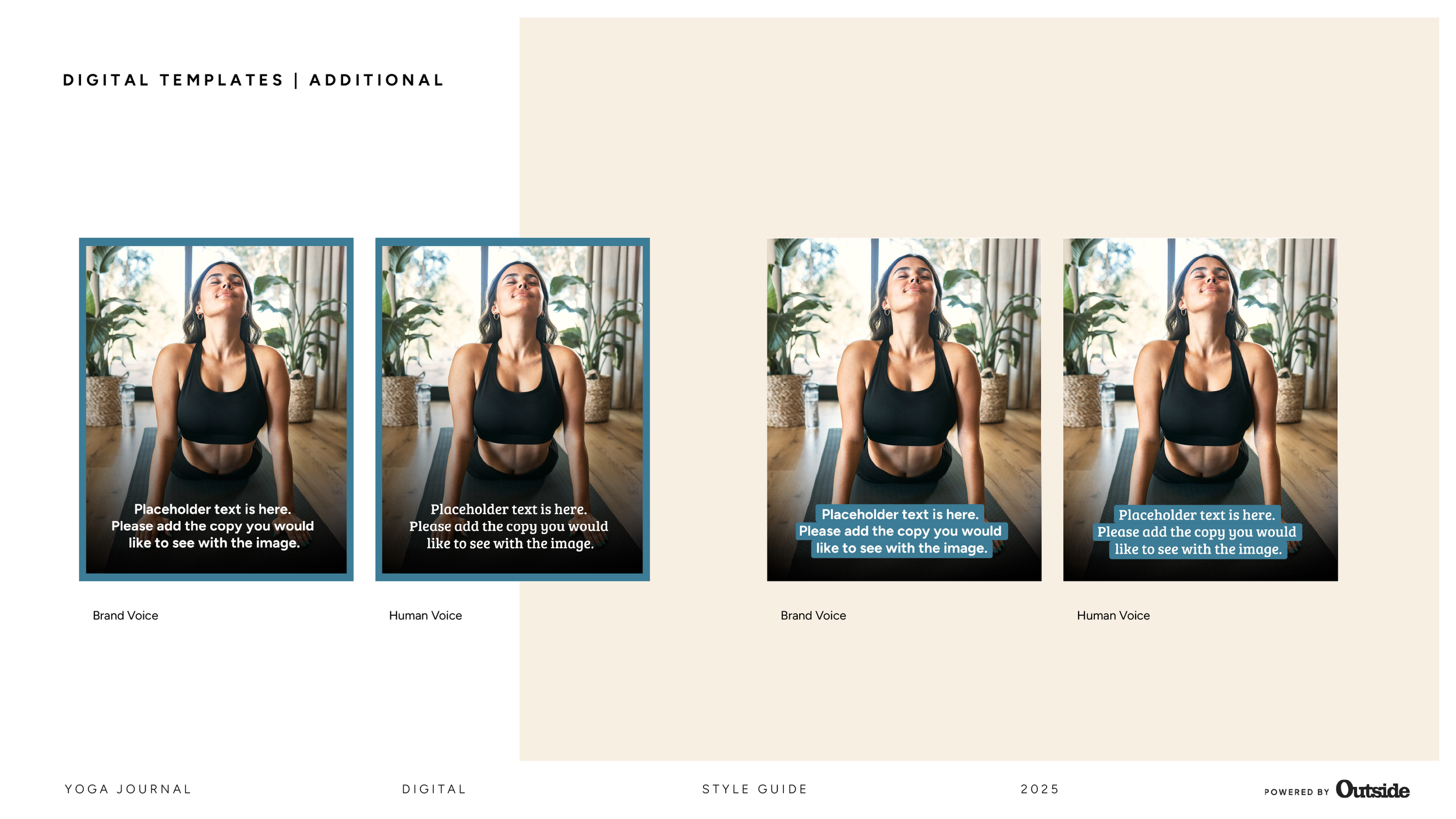
Designed as a working document, the guide helps maintain a cohesive visual language across print and digital formats, while still allowing flexibility for evolving editorial themes and seasonal content.
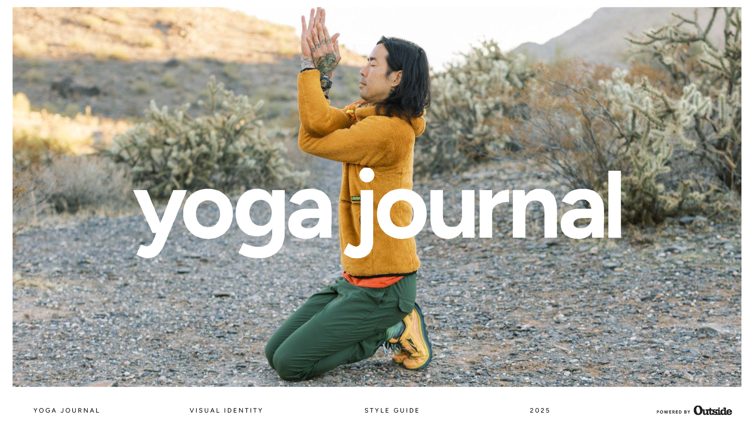
Brand Style Guide | Yoga Journal refresh
Role: Creative Director
Tools: Indesign, Figma and Google Slides
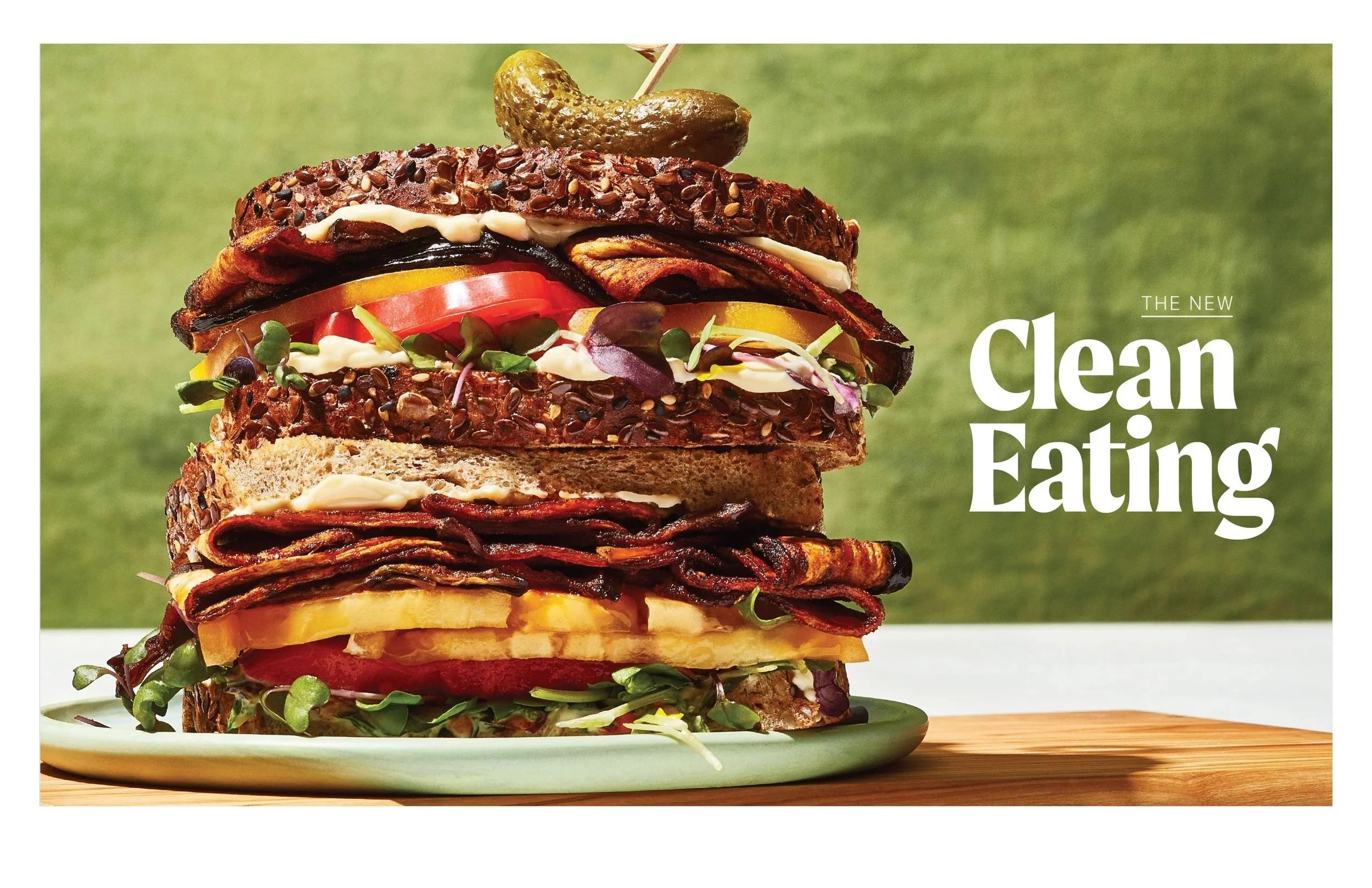
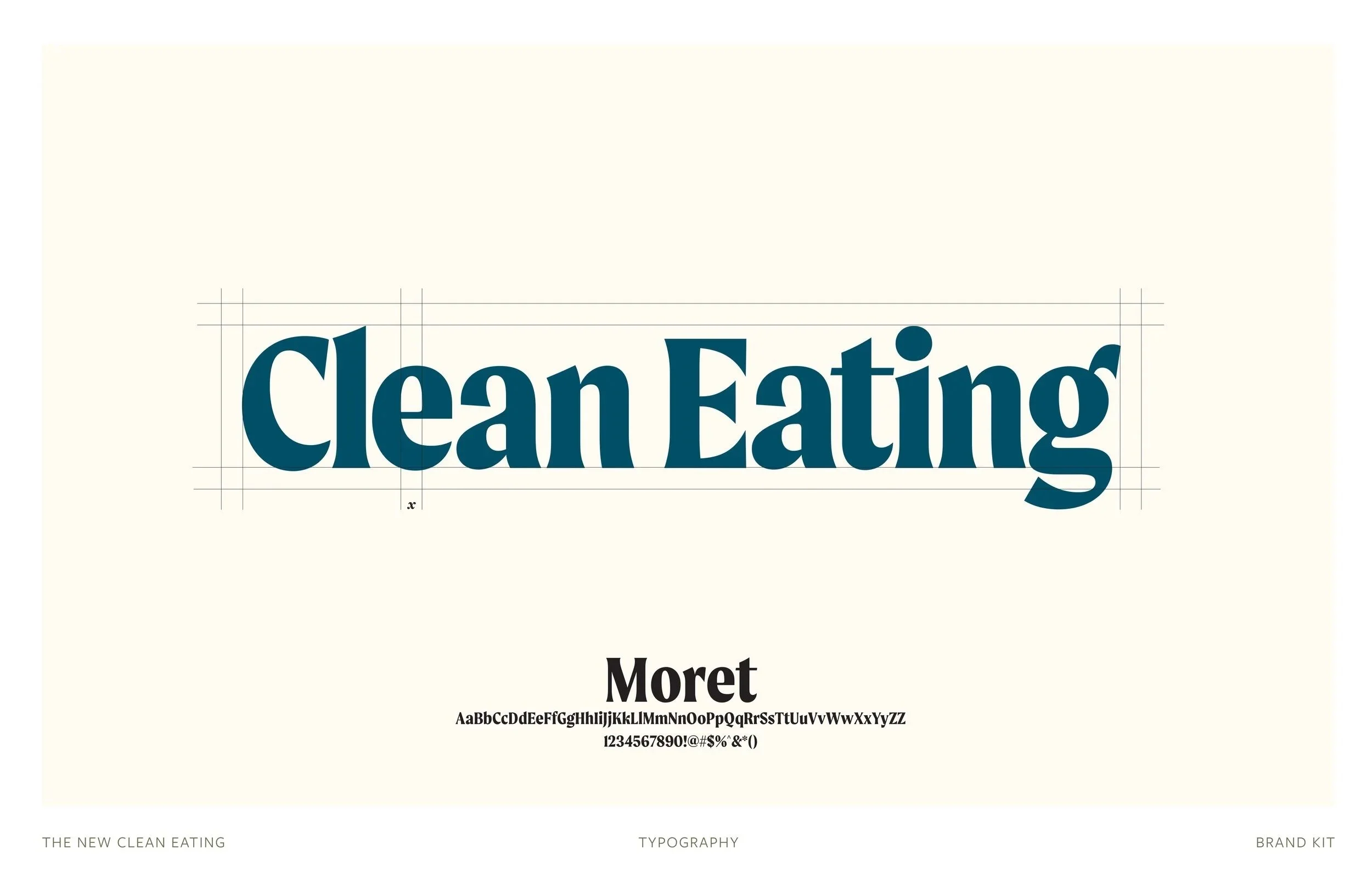
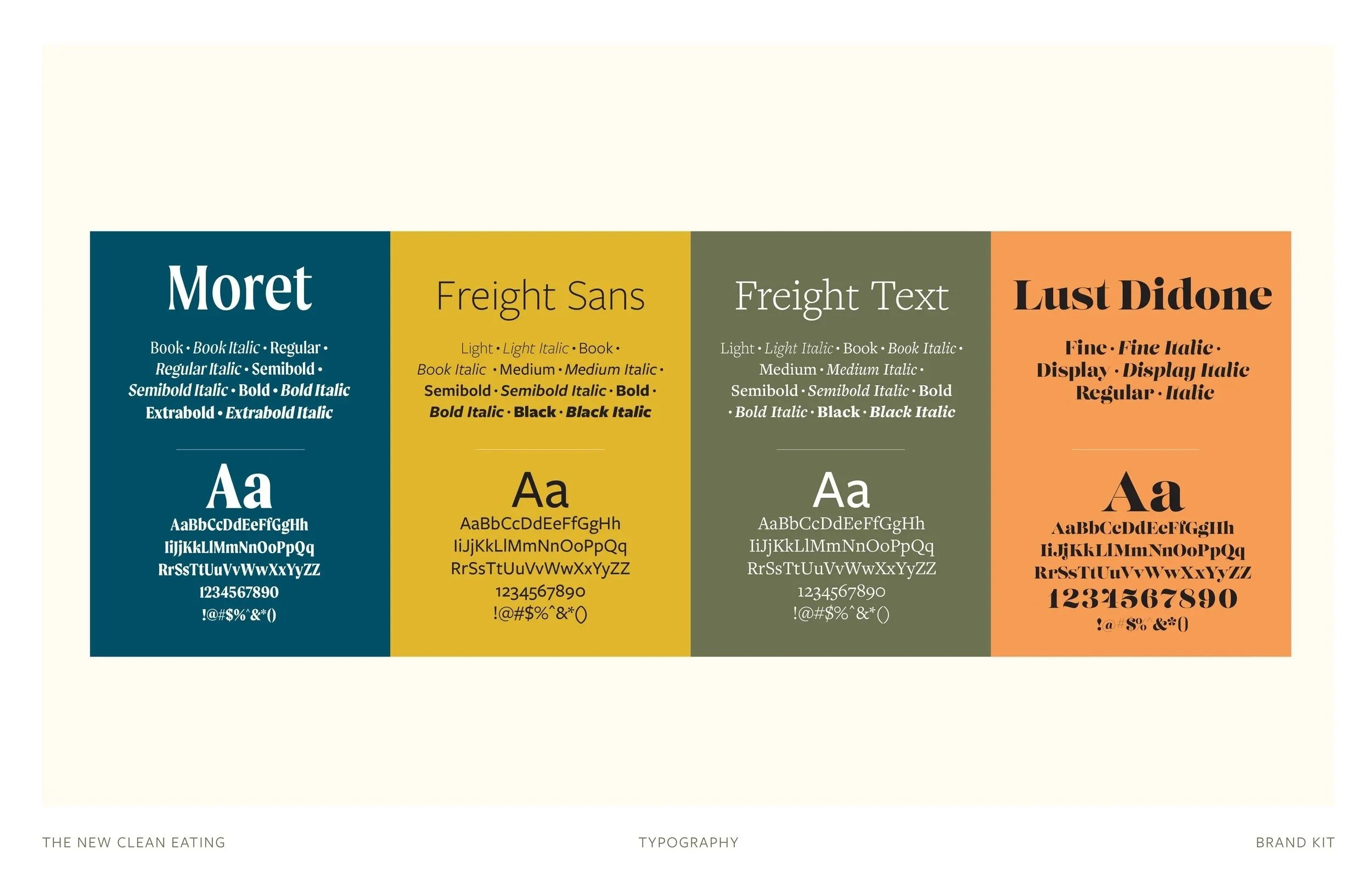
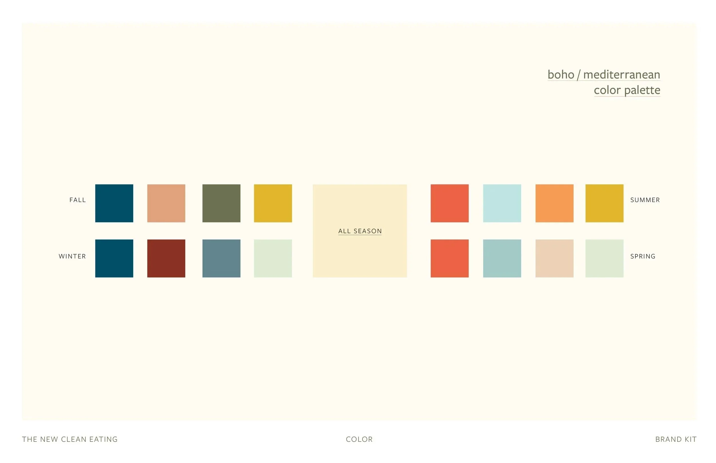
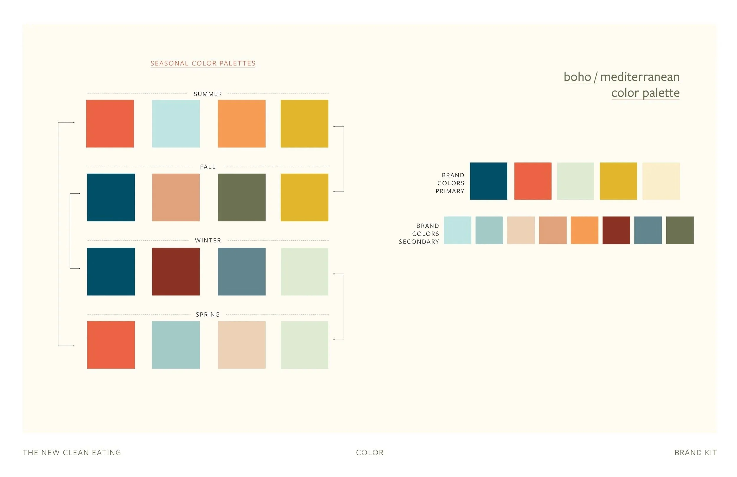
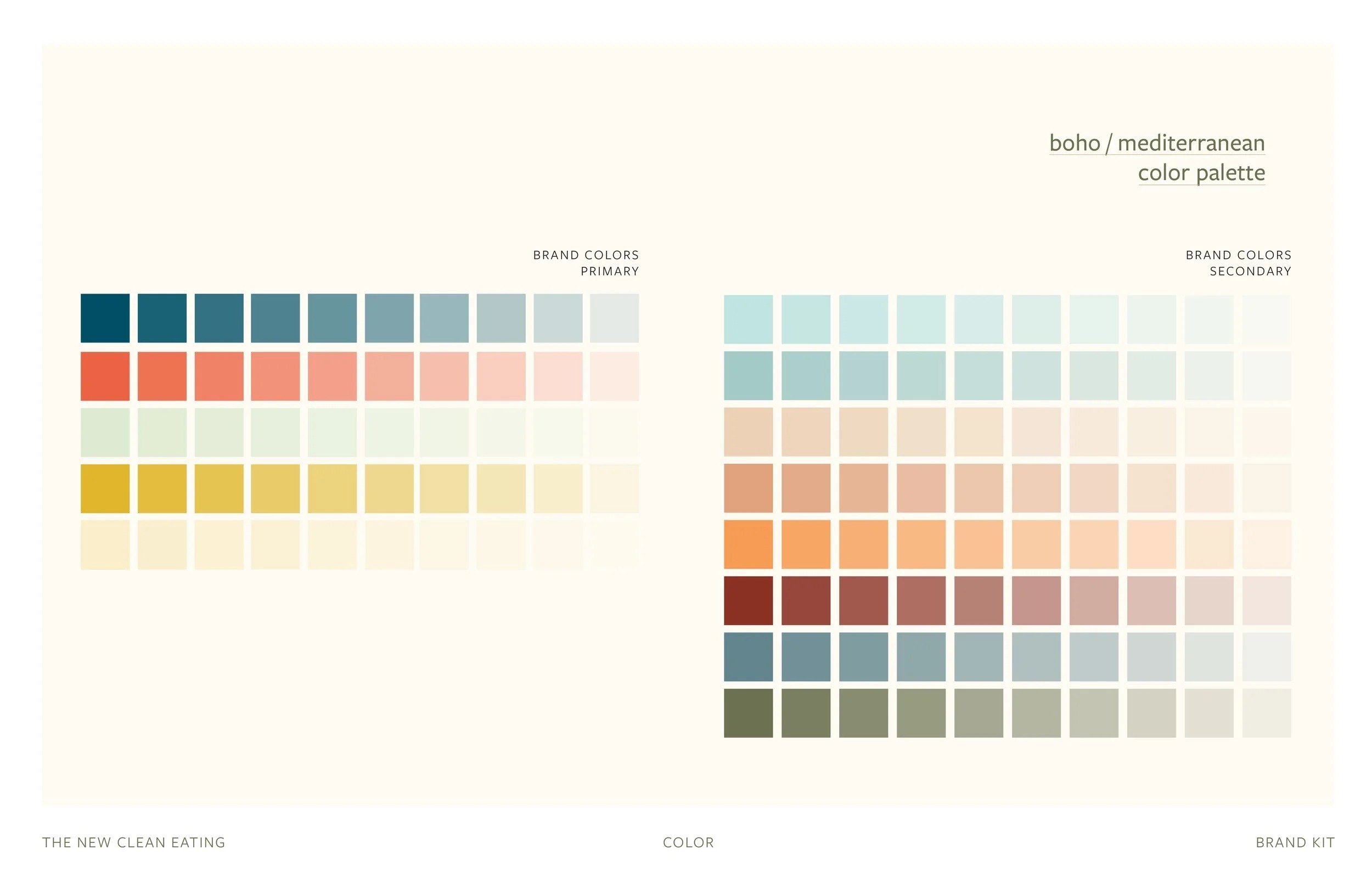
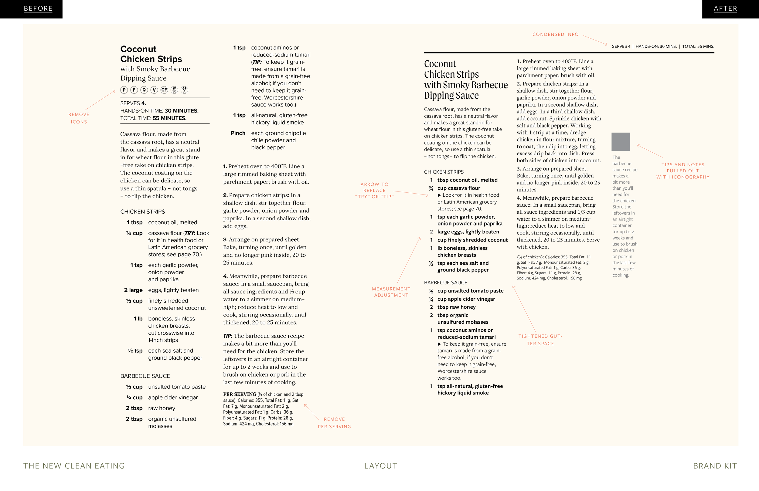
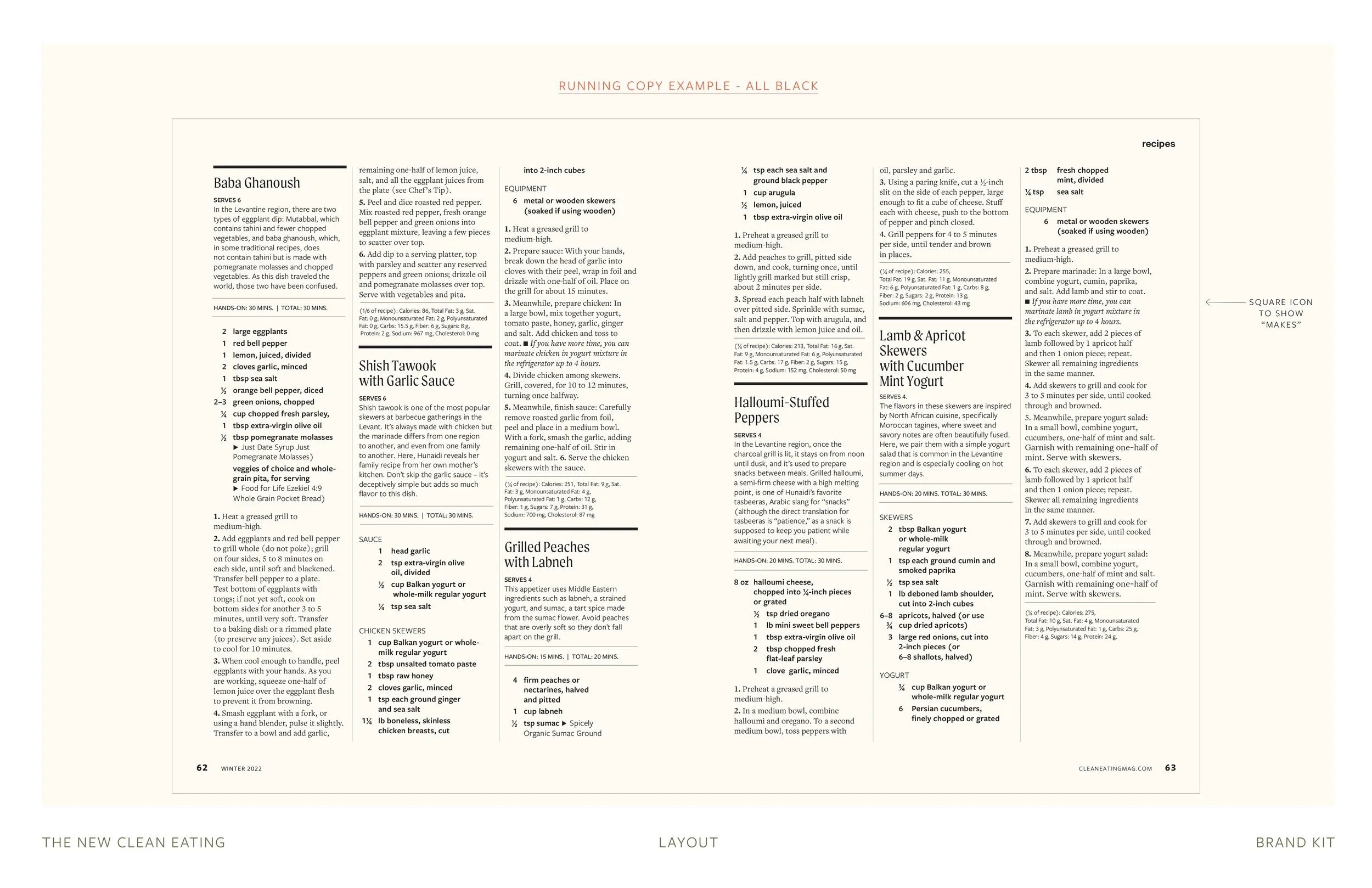
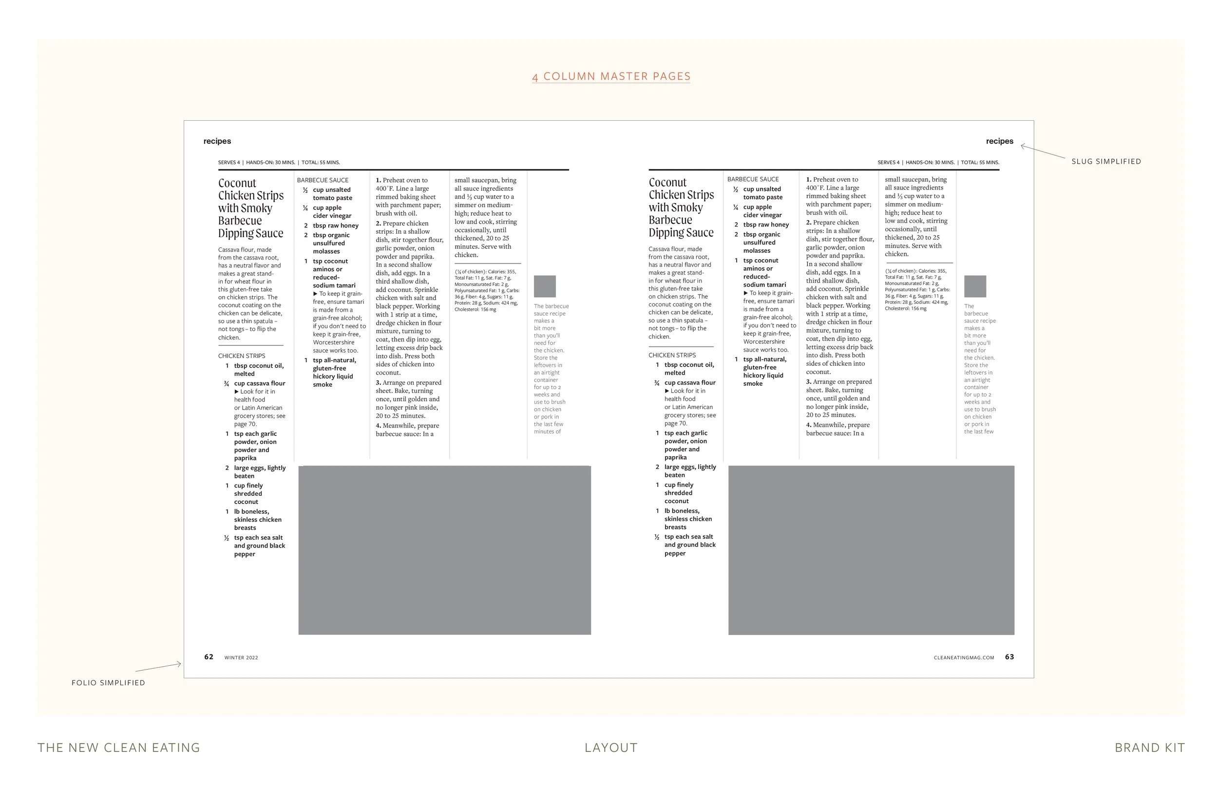
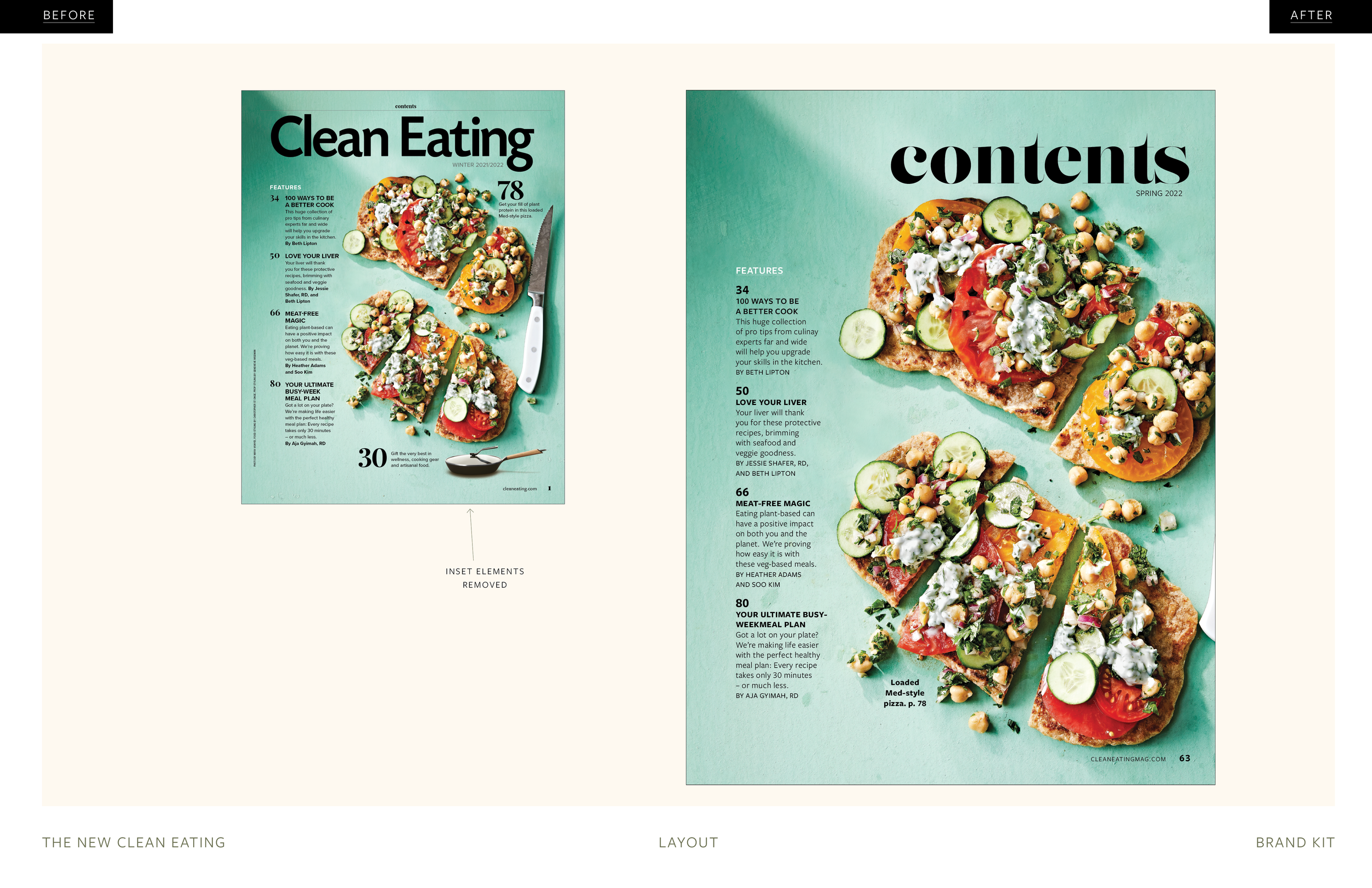
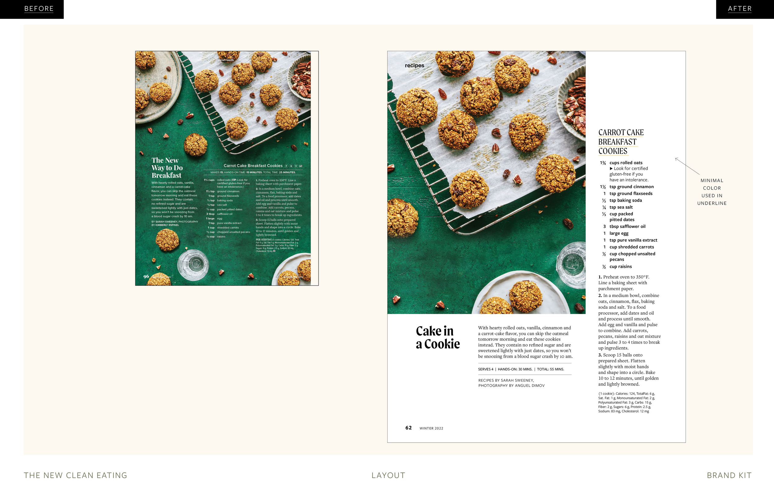
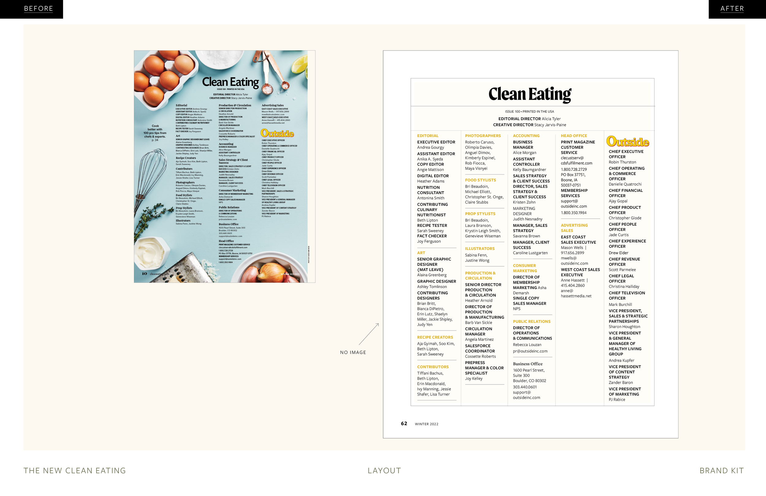
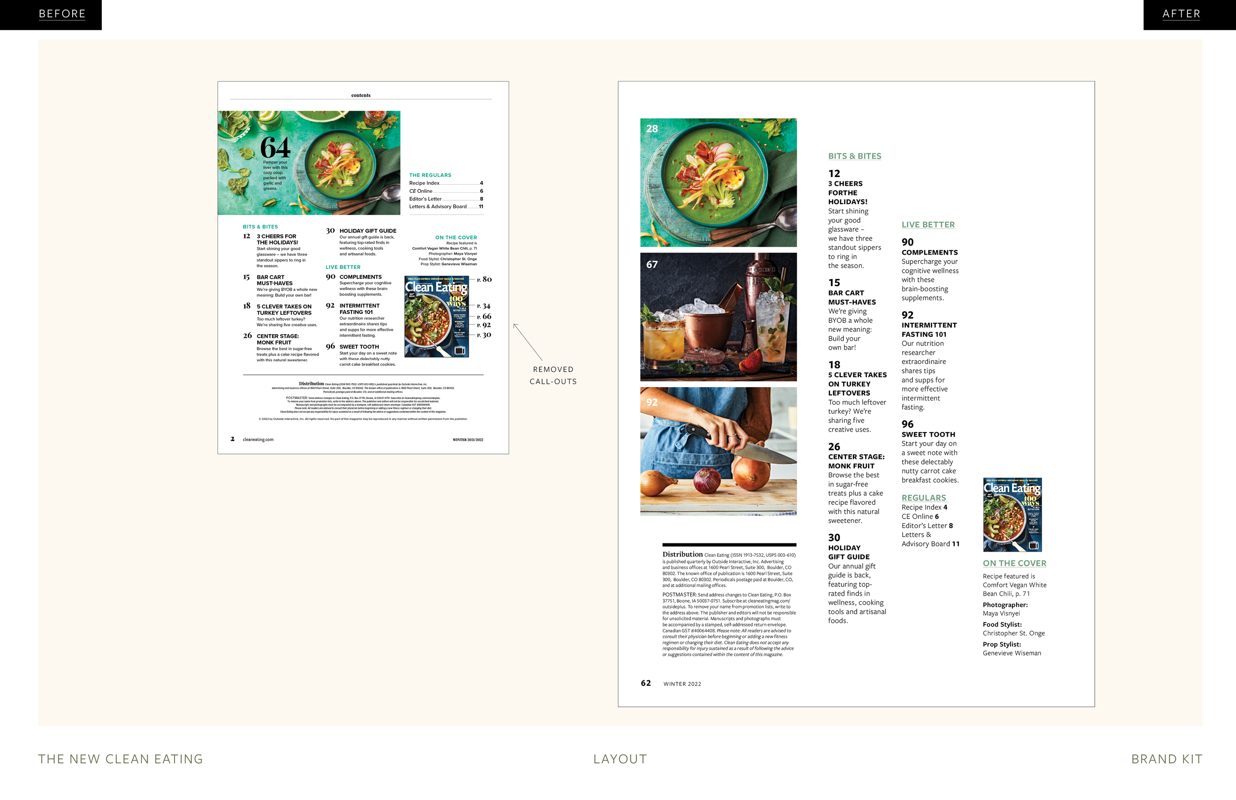
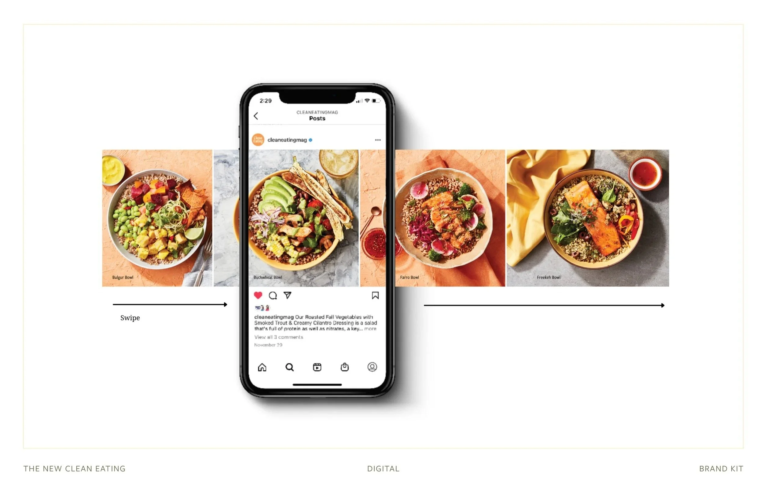
This comprehensive brand style guide was developed to ensure consistency and creativity across all aspects of Clean Eating’s brand refresh. It defines the magazine’s typography, colour palette, photography style, and layout principles, reflecting the publication's vibrant, approachable, and food-focused ethos. The guide serves as a tool for maintaining a cohesive look and feel across print and digital platforms, aligning with the magazine’s audience and culinary themes.
Brand Style Guide | Clean Eating refresh
Role: Creative Director
Tools: Indesign & Photoshop